Dating Website Logo
I threw this together last night.
The ideas:
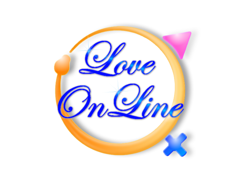
The gold snake/ring is ouroboros - a symbol of things cyclic or something constantly re-creating itself (like people - hence appropriate for a dating site). Sometimes seen in rings of betrothal or marriage - this should explain the golden color.
Male and female symbols are my take on the generic male = circle with arrow and female = circle with + signs. I got the colors backwards - but it's too late now. Blue should be the male symbol and pink the female. Doh!
The text is Edwardian Script with a linear reflected gradient to provide some texture. A highlight (or sparkle) on the leading letter gives a gloss effect to make the text appear slightly shiny.
The rest of the logo is shadowing and shine on the major elements.
The whole logo took me less than two hours to complete.
No comments:
Post a Comment